Birth of a Monster Part 1: Creating Unspeakable Guidelines
Birth of a Monster Part 2: Conceptualizing the Horror
Birth of a Monster Part 3: Molding the Abomination
Birth of a Monster part 4: It’s alive!
by Jonas Steinick Berlin
Thomas gave me almost full creative freedom. The basic guidelines were that it had to be a humanoid and nothing like standard zombies, “The Infected” in Penumbra: Black Plague or the creatures in Dead Space. It should also fit the the story of demon-like creatures taking over human bodies and be super creepy. Apart from that, I was free to do pretty much what I wanted.
This was my first character design for a commercial game, so I was a little bit shaky. The great freedom was both exciting and quite overwhelming. So many choices! I first researched and got inspiration from unusual anatomy, photos 18- and 19th century clothing (the time in which the game takes place), surrealistic paintings and various disturbing stuff.
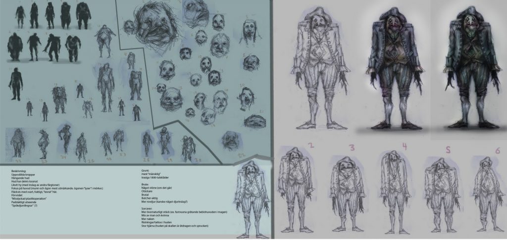
I then continued brainstorming and did a lot of small quick sketches of character silhouettes and different faces. I really wanted to avoid stereotypes and do something unique and memorable. Every single doodle got assembled on a collage and I then showed it for Thomas. He said which parts he liked and from that I went on and created something more detailed. At this time I had a design in my head that I really felt would be perfect. I drew it down with details, colors and lots of love. The result was something of a hunchback with interesting clothing fitting the era and a really grim face. This is perfect I said to myself! Excited I showed it for Thomas. However, I quickly got knocked down to earth again when he said that it looked too funky and resembled “Grodan Boll” (which is a character from a Swedish children’s book taking the form of frog). I got instructed that I should avoid the cartoony style and make something more realistic, something that you almost could find in real life. Thomas also thought that it should have a lot less clothes.
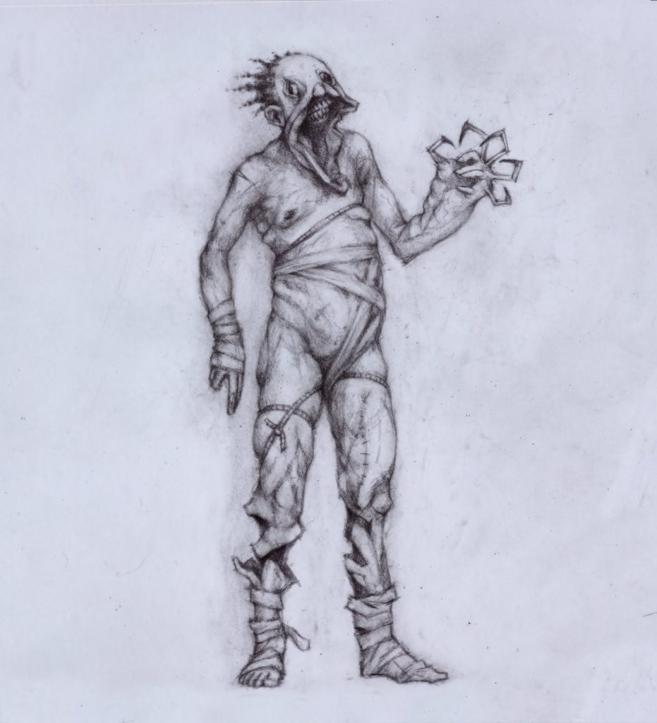
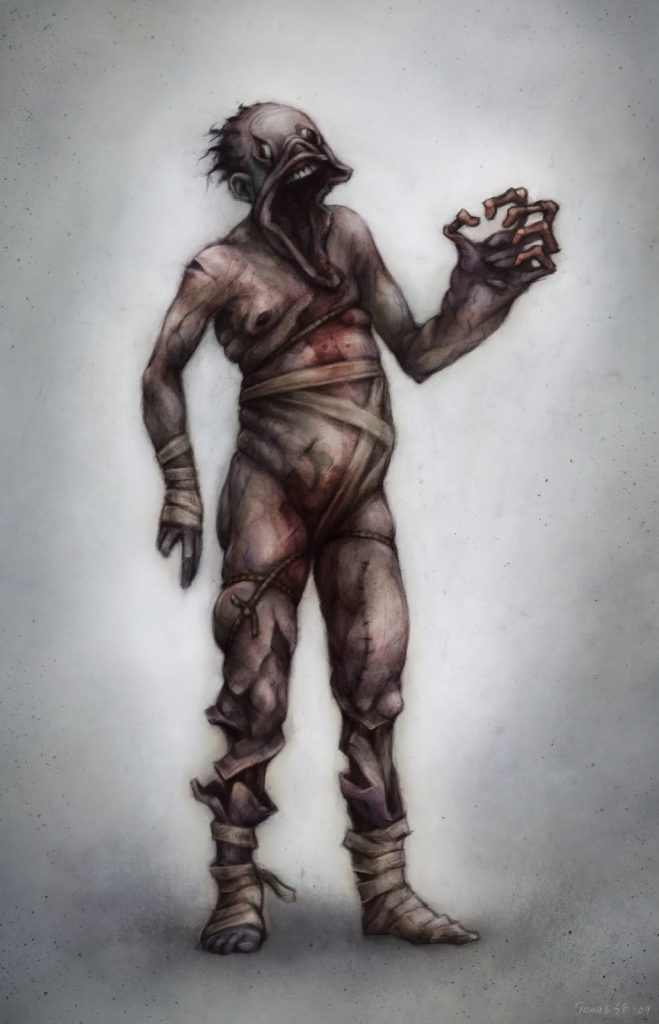
After this setback I started putting a lot of attention on the head of the character. I think this is the part of the human body that you can make the most disturbing because of the emotions it can show. I instantly chose to give him a crushed jaw with parts of skin hanging down and eyes with dilated pupils which pointed in different directions. Thomas approved of this and I moved my focus to the rest of the body. Important here was to get the feeling of a demon possessing a body that it was unfamiliar to. The creature should try to deform the body into a, according to its own twisted standards, more familiar form, breaking bones and bending joins while doing so. It should also have accidental injuries and be held together with bandages and ropes.
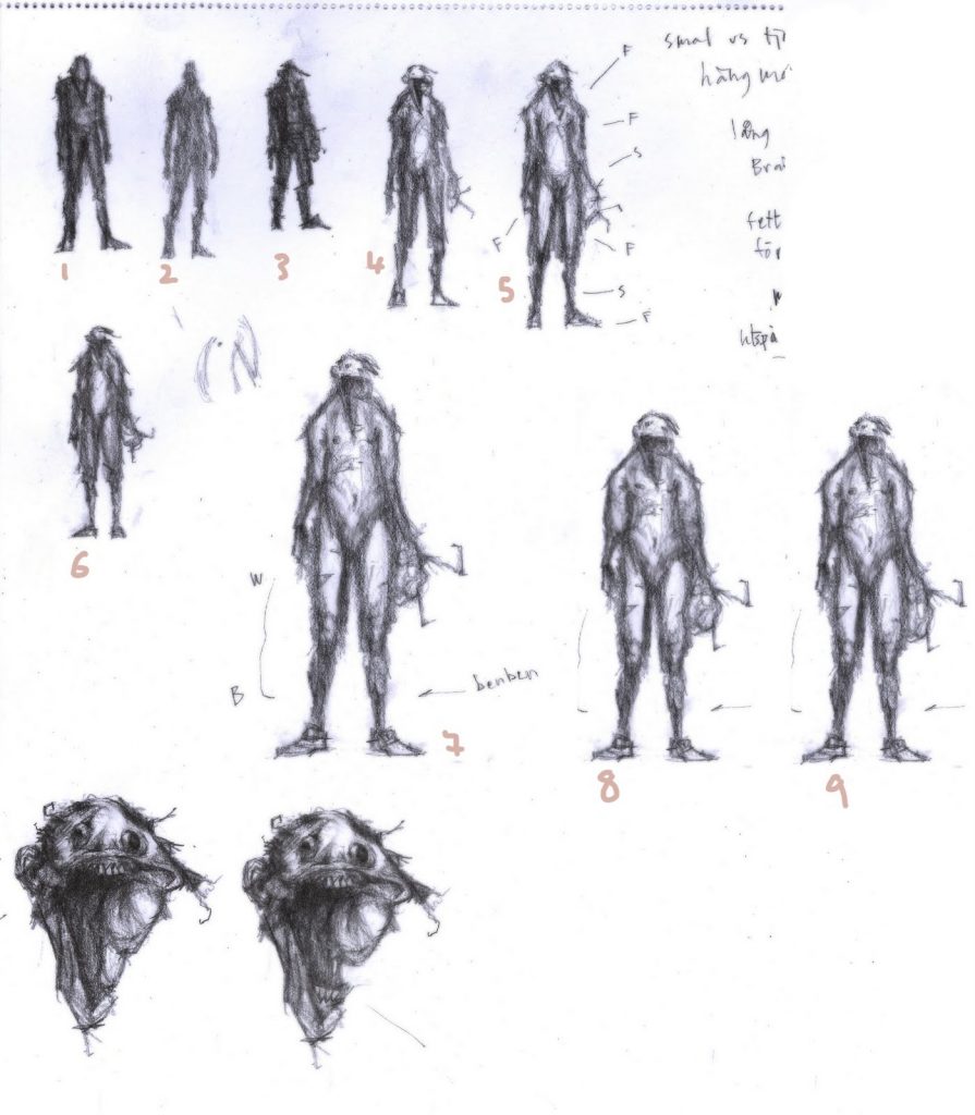
Because of the lack of clothes we had a discussion about showing genitals or not, but soon scrapped that idea after we realized that it would be best not to tease the rating systems too much (this turned out to be a non-issue as other part of the game show /Thomas).
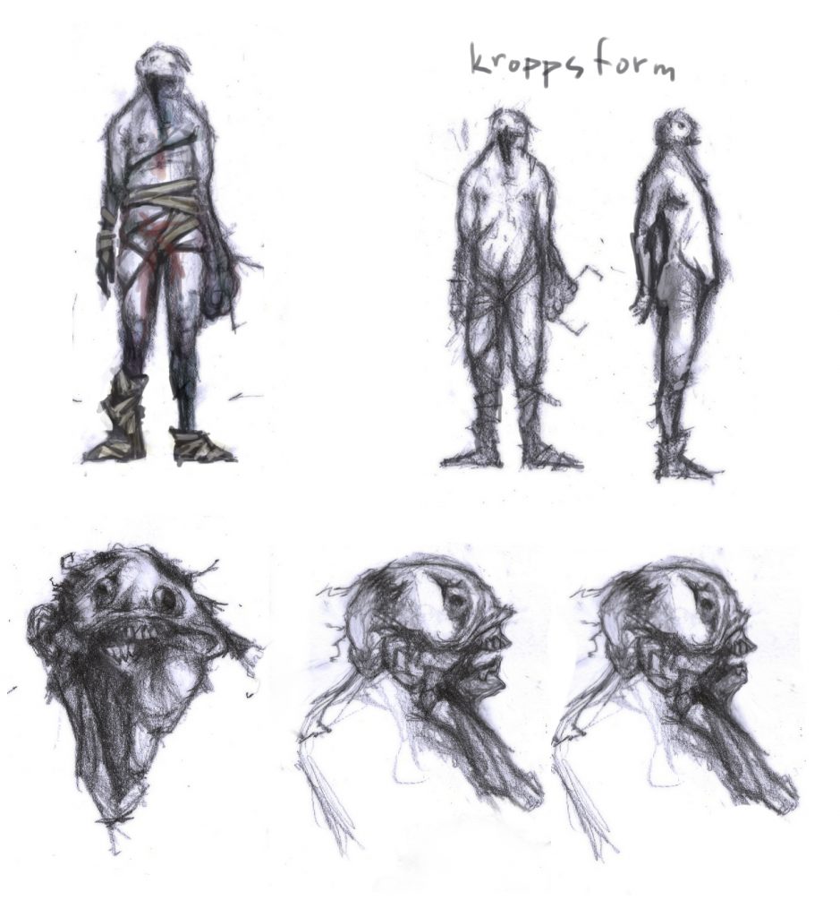
One thing that was hard to decide was the final look of the left hand. It had to be deformed in some way, but yet be usable and able to be used as a weapon. I did at least 10 different arm designs before coming up with something that we could use. For example I did an arm in the shape of snowballs with spider fingers and one arm twisted in a spiral, with its bones pointing out. The final hand-design was more of a claw with bony fingers that we thought would be perfect for both scaring the player and give a good scratch on the back.

When I did the detailed final concept I started by drawing it up traditionally with a pencil. This may not be the most effective way to work (because it makes it harder to do big changes and also caused unwanted coffee stains), but I feel more in control this way and find it easier to do the smaller details. After that I scanned it and quickly colored it in Photoshop using multiply layers. I first tried a bluish skin tone, but it made it feel too much like an alien, so I changed it to a more desaturated one, warmer colors with elements of purple, blue and yellow to create a pale corpse-like look. At this point it didn’t feel too professional and had to go over the concept with Photoshop to add the final touches, such as highlights, noise removal and sharpening. The Photoshop-file ended up having forty plus layers, most of them containing small and unnecessary changes. Nothing I recommend, because of the insane file size, but this time it did the trick and I managed to convince Thomas the concept was completed.
The art was now done and could now be used by the modeler to create the actual 3d asset.
