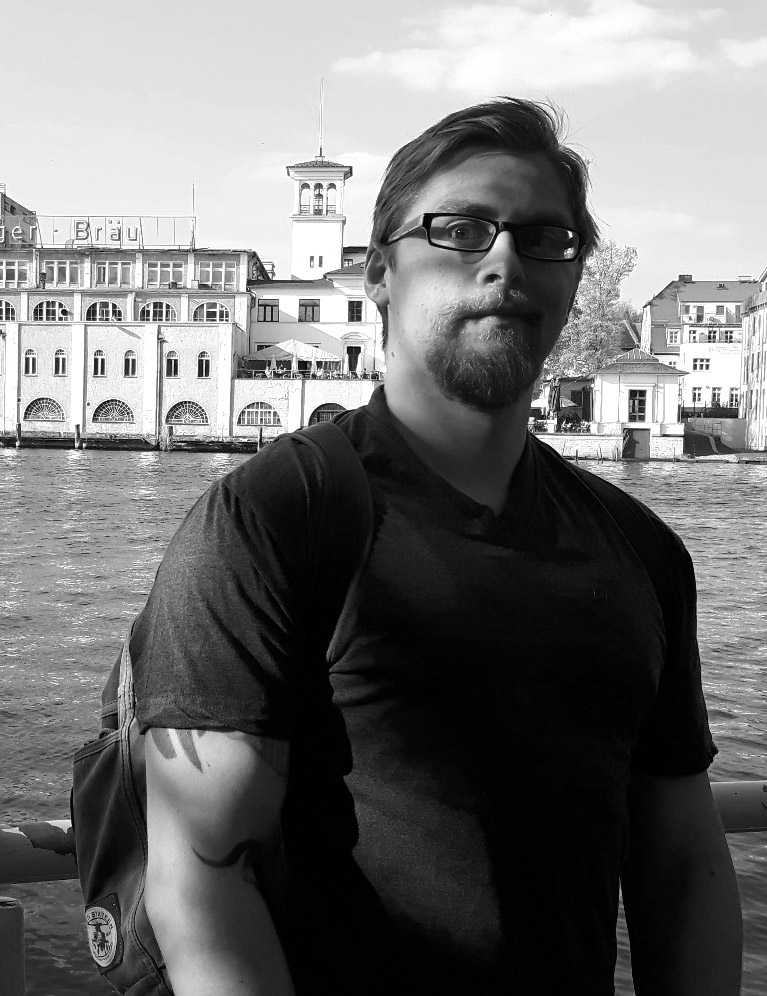
Hello, my name is David and I’m the “General Purpose Visual Design” person at Frictional Games, and Art Director on one of our new projects. I’m one of the newer members of the team, with only a bit more than 3 years at Frictional under my belt. Originally I joined as a graphic designer to make in-game logos and GUI graphics for the company. My first release with Frictional was Amnesia: A Machine for Pigs, for which I made lots of 2D assets.
Before I joined Frictional Games I worked as a freelance Graphic Designer on a few small indie ventures, but mostly paid my rent by painting cherries and lemons for a local slot machine company. I got the job through a friend who was passing their customer on. That is a nice habit in my opinion: if you part with a customer who was nice, pass them on to someone else. The job itself was well-paid and everyone was nice, so I could have just stayed with them for the rest of my life and been content and grow old or something. But ultimately my ambitions got the better of me and in my free time I helped out on indie projects like Kinesthetic Games’s Kung-fu Superstar or Pulsetense’s Solarix. Usually I’d design graphics or do some promo art. Chatting with former Lionhead member and head of Kinesthetic Kostas Zarifis gave me the confidence to make a push for a proper games job. I wrote to about 5 studios a week to see if they’d take me in as a freelance graphic designer or concept artist and Frictional Games answered!
Before that, I worked for a German TV thinktank, doing a lot of prototyping and pitch writing in different areas. Since I am probably forever bound by contract I can’t really get into any details. In broad strokes it involved creative writing for advertising campaigns, building prototypes in various game engines, concept art, animation, and lower management. Apart from a small flash game (that only went online for the duration of a small Christmas event) and an intro sequence for a local but now defunct TV show, the pitches and prototypes are rotting away in some corporate dungeon. Nevertheless the time there was important to test my skillset and train for later jobs.
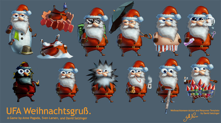
In between I had short gigs in advertising, teaching Photoshop, doing small illustration commissions and giving life-drawing classes (nothing is quite as entertaining as making stuck up people in their early twenties look at real-life genitalia) . But my first real jobs were as a cleaner and dishwasher in Austria after I dropped out of high school and pretty much tried to be the nightmare of any parent or teacher. Fellow artist and partner in crime Anne Pogoda invited me to Berlin and pushed me to apply to a design academy. I got a student loan and finished with a major in art direction and photography a bit more than half a decade ago. Shout out to my AD and photography teacher James Higginson, who gave me the push to go for the hard stuff and taught me not to be content with my own inner status quo.
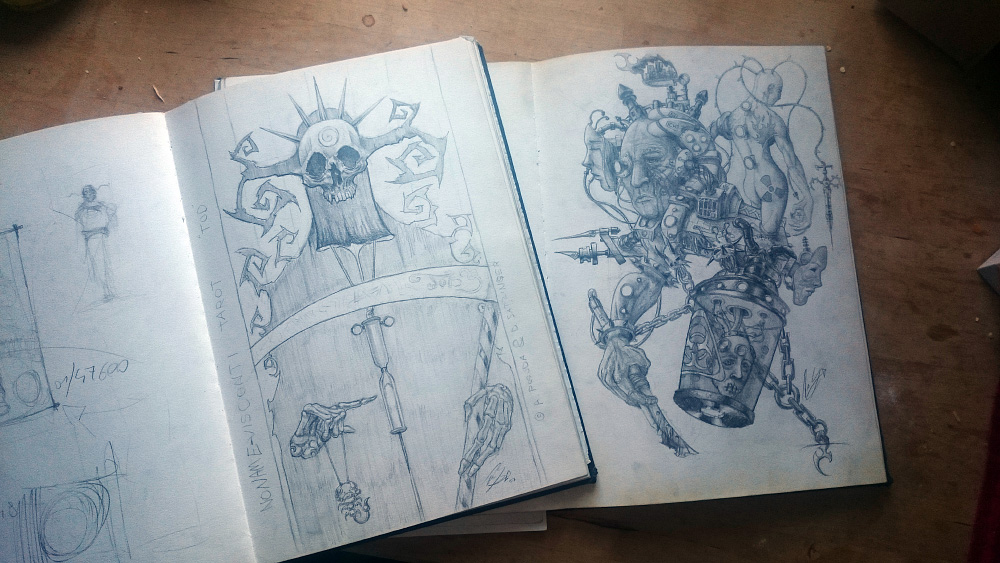
I don’t really have stuff left from my childhood but these two sketchbooks are from around 2004 and 2006. I was hugely into drawing around that time. My favorite game was Morrowind and together with others we’d create simple mods for it. This was actually the first time I ever thought of creating games. That interest in messing with existing games quickly expanded to Quake 3, Doom 3 and so on. When I got away from game community forums and into specific art communities I strayed away from gaming and put most of my focus into illustration for a long time.
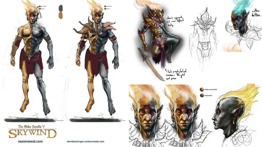
That was nice for a while and helped me build some basics. Sadly I was never quite happy with the community, because it started to reek of community vendettas, strong attitudes, and increasingly weird views on the reality of the industry . So I looked at other stuff and the design academy helped with that. Every now and then I still dabble a bit in modding, though. In a nice example of everything repeating itself I got the opportunity to help out the people of the Skywind project with some concept art two years back. Sadly, there wasn’t enough time to get really involved.
A big part of my training was doing a lot of studies from old masters, from life, and the usual “one sketchbook page per day” thing. Lots of repetition to develop an instinct for things. What this approach often lacks, however, is the development of an actual understanding of what you do and what you could do or how to combine things. I’m not a fan of painting for painting’s sake. That all looks pretty eventually, but I think the really interesting stuff only gets created if put in context with an overarching goal or to solve a problem. Essentially, it’s the same as in resistance training – you need more resistance to become stronger.
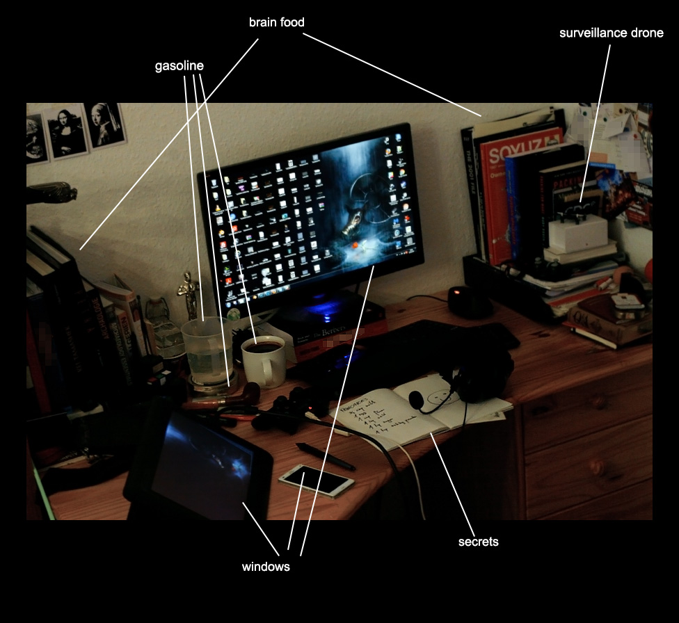
Nowadays I don’t draw that often anymore or have any significant private projects. However most of Frictional’s projects hit close enough to home that I don’t feel bad about that. I’ve got a big interest in a lot of different things (like animation, 3D, photography, etc.) and have sort of become a jack-of-all-trades. Of course my more specialized skills have taken a toll under that, but in the long run it’s allowed me to have a much wider toolset to attack problems with. Oddly my online presentations are still heavily focused on illustrative skills and probably give a false impression of what I actually do (because of my own laziness. I treat my online portfolio the same way I treat my desk apparently 😛 ).
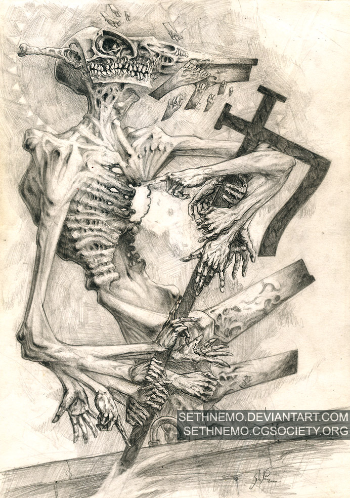
As for my design philosophy, I really like working with thematic contrasts in a lot of my work. For me it creates a lot of tension where opposing parts are touching each other. Also in my process is always a step that is essentially “doing something else and letting the subconscious worry about the work”, which is something I learned from one of my academy teachers. He advised to do a lot of research and brainstorming and then basically to go out and occupy yourself with something that had no obvious connection to the work. Without knowing it, you’ll create connections or draw inspiration which mutates into something that fits your project. I find this especially useful for a lot of high level design problems such as finding a stylistic direction.
Another huge part for my process is the actual research itself. This usually goes in 3 steps. First, I go to Google and Wikipedia and filter through various forums and blogs to get an idea about the broad strokes and common knowledge of certain things. Then I’ll invest money to buy textbooks on specific topics (if I look into a culture, I get a book about the culture, etc.) and sometimes I’ll also buy various objects like models of machines or tools. The last step is actually going to places. Sadly this isn’t always possible but actually being in a place you research gives you a profoundly better understanding of what you’re dealing with. Don’t go to Google for 10 minutes and take 3 pictures from the image search. That is sloppy and will make your final product less good than it could be. Minimal research leads to design that easily can end up as the lowest common denominator and which has been done to death by other people already. Dedicate a good portion of pre-production to research if possible!
Working in teams is great. For most of my career I’ve been working in teams or looking to work with teams. It doesn’t matter if these people are your friends or if you hate their guts, the creative exchange and working towards a common goal will almost always be more beneficial for the product than going in solo. This is especially true if you can’t show your work-in-progress to the public.
Lastly it always helps if you can bring something personal or biographical into projects. This and research will help to make your product feel more authentic. It’s better to create a simple thing that is comfortable with its own identity than something pretentious.
I like to draw inspiration from a ton of different things, so it might not make sense to list anything in general. At the moment I’m trying to learn a bit about history and engineering, so most of my ideas come from that. Also I recently rewatched the old Berserk anime and so of course would love to do a grimdark fantasy project with a strong focus on interpersonal relationships at the moment (GRIFFIIITH! D: )… until I see something else that’s amazing and want to do something in that vein. I tend to lean more towards darker subject matter which is a bit more experimental and usually something that plays a lot with different kinds of emotions and symbolism.
What else? I like weird and loud music, movies and lifting weights. But enough of me, let’s talk work! Here are some images, and I’ll go a bit into the process behind them. All of these are typical day-to-day work and not the polished stuff we release for marketing reasons that looks all polished (for some of that you can go through my SOMA folder on DeviantArt). Many of them represent the start or middle of a process.
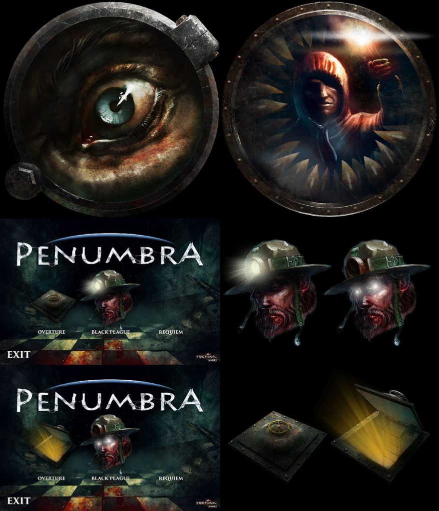
Here is a sample of work I did alongside the big projects. These are assets for the Mac version of Penumbra and Amnesia as well as for the Penumbra Collection. Other stuff included making icons for different applications, creating assets for online stores, working with outsourcers on ARGs, worrying about corporate identity and so on.
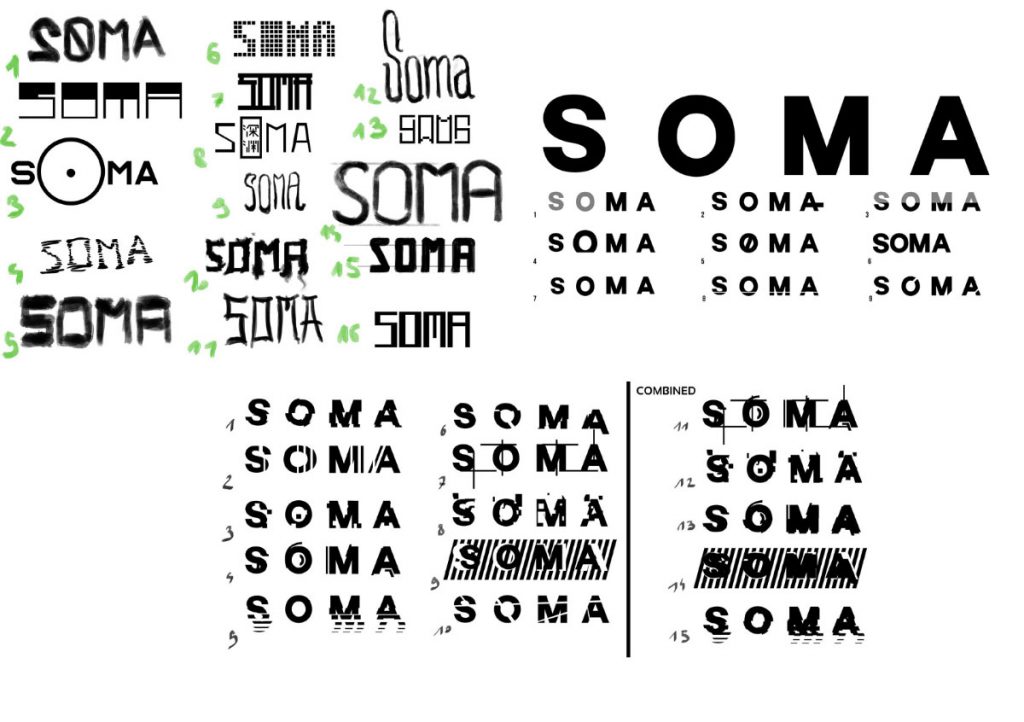
Here are some of the steps the title logo for SOMA went through. Given the time this is a preferable process. Of course the game also contains a ton of ‘one-shots’ where you only have a day or maybe just an hour to come up with a solution (I think the Haimatsu logo was one of those). This one was mocked up in Photoshop and later vectorized.
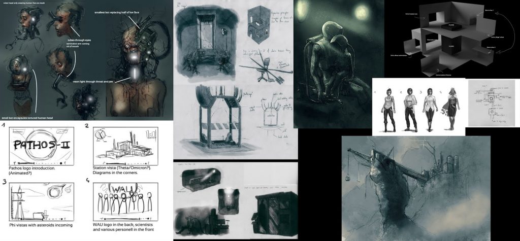
Often when ideas crop up or if we need to find a solution to a problem, Rasmus and I will produce a lot of sketches for brainstorming to home in on what we feel is a good direction. On this you can see ideas for the Robothead, Omicron, the train movie and Catherine.
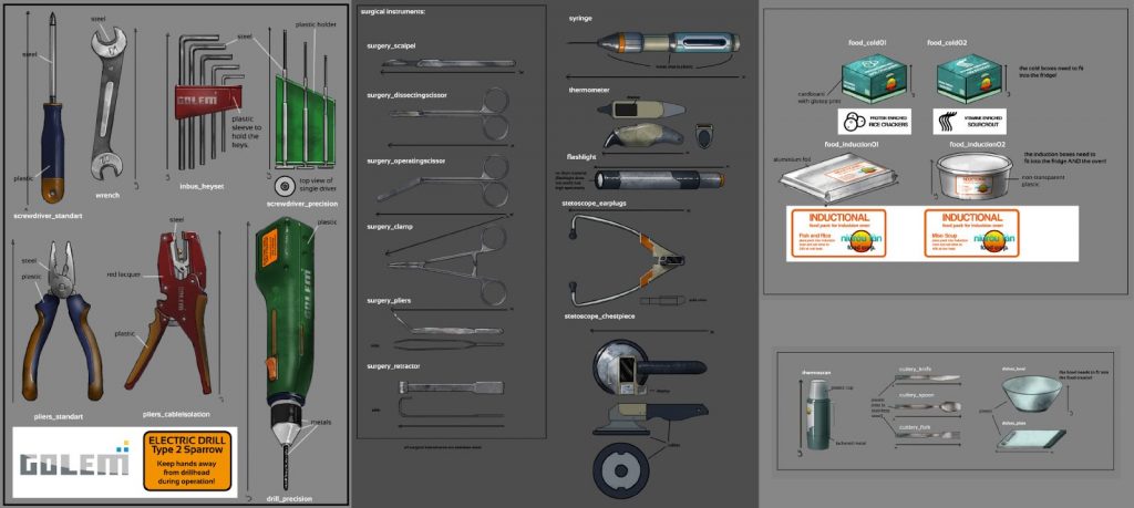
Next to all the hero props there’re usually a huge number of small items spread across the levels. Many of which you can grab and toss around. If memory serves right, we designed around 200 props over the course of a month at one time in production. All things considered, we’re still a very small team and Rasmus and I are the studio’s only in-house concept artists for most of a project. Even the best planning can go sideways sometimes, and then you’re stuck with a three-people task for one guy. It’s a good thing we came prepared with an established style that’s easy to do, so we were able to make very simple drawings and trust in our outsourcers to interpret things correctly. (This is definitely not always possible. In one of our current projects we can’t do that, and need to apply a much higher quality in the prop concept art. As a matter of fact, the 200 props mayhem was a very big exception.) For example, these are almost all isometric, do only feature flat shading, almost never feature specific texture or material hints, are very uniform in shape, etc.. Then you can do 10 a day quickly and focus on standouts like logo designs or repeating details. These would then be passed on into the hands of our great outsourcing team.
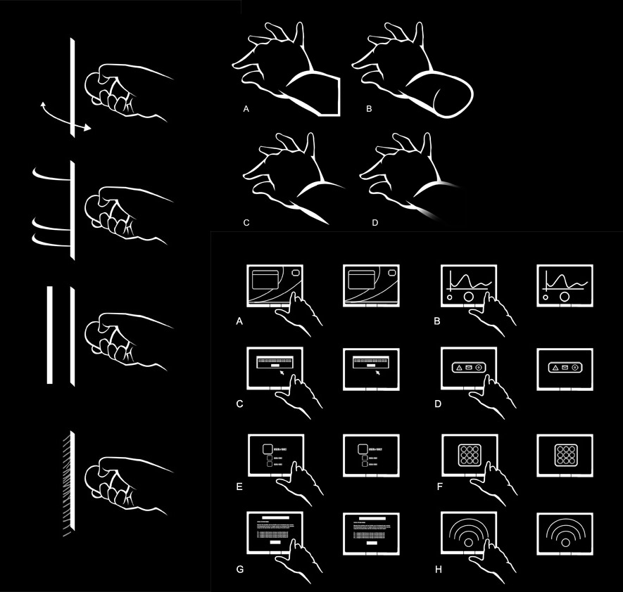
Doing these was actually the very first task I ever did for Frictional. These are actually traced from photos of my own hand.
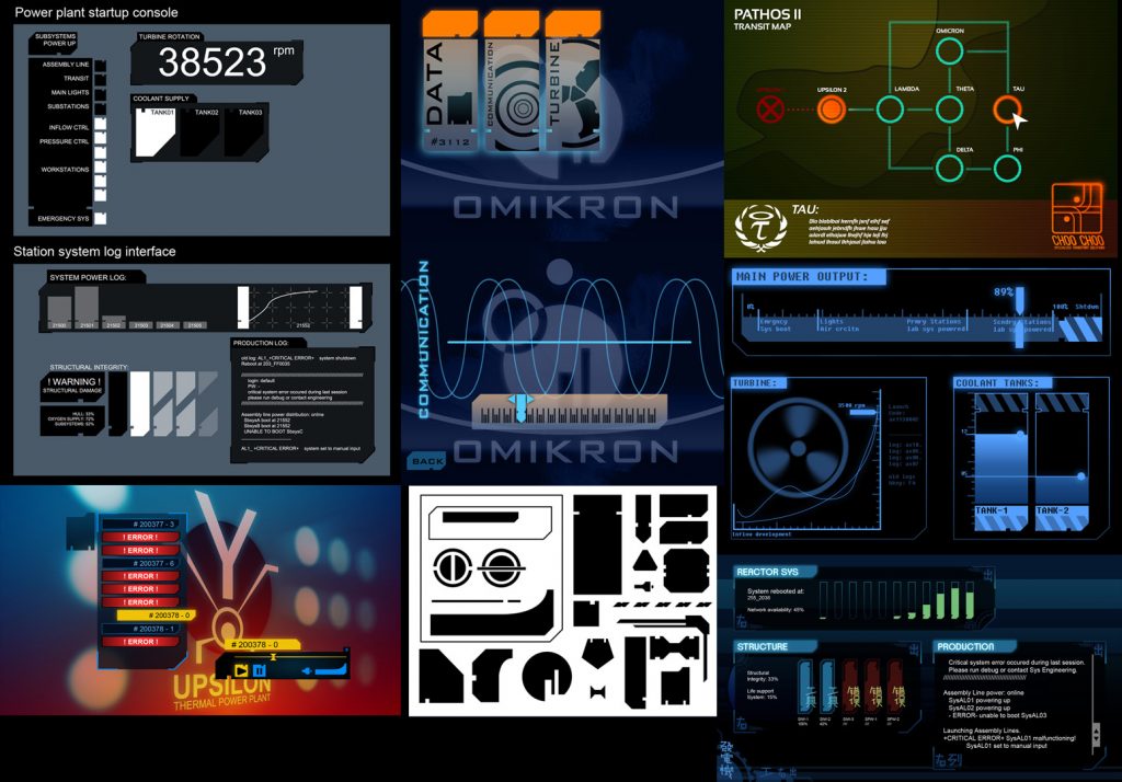
Like the title logo, the terminal graphics went through a lot of iterations until we arrived at our final version that you see in the game. Note how it used to be a lot flashier. There were also often animated pre-visualizations made to check in advance how things look in motion. In general I prefer to do an animated mockup for technical designs (be it terminals or props).
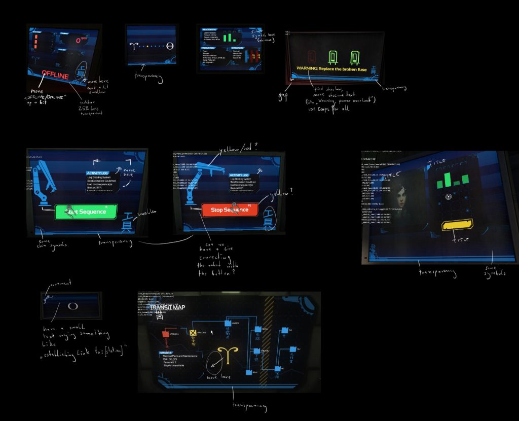
Another important part alongside testing out iterations through mockups is to actually start putting things into the game. A scripter would implement the graphics in the game and do a first pass on the interactions so I could look at it and do iterations on my graphics or ask for changes. This back and forth is essential for us.
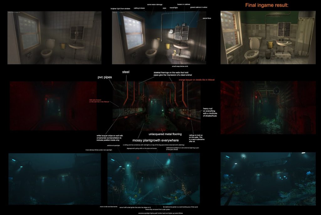
Speaking of back and forth, one of the tasks I liked most during the production of SOMA was to go in, take screenshots of early level builds and overpaint them, suggesting additions or changes. Then the level designer and artists in charge would also bring in their ideas and changes.
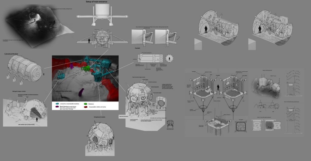
Another thing that I did a lot during production was creating isometric concept art. These are very quick to do. Since we are a small team it was easy for us to focus on a visual direction and to keep everyone on the same page. In most cases a black and white isometric design was enough for the level designers and artists to do something great. This only really works when the general style is already set though, or nobody will know what colors and materials are appropriate.
Okey, time to show you some stuff that was discarded during production!
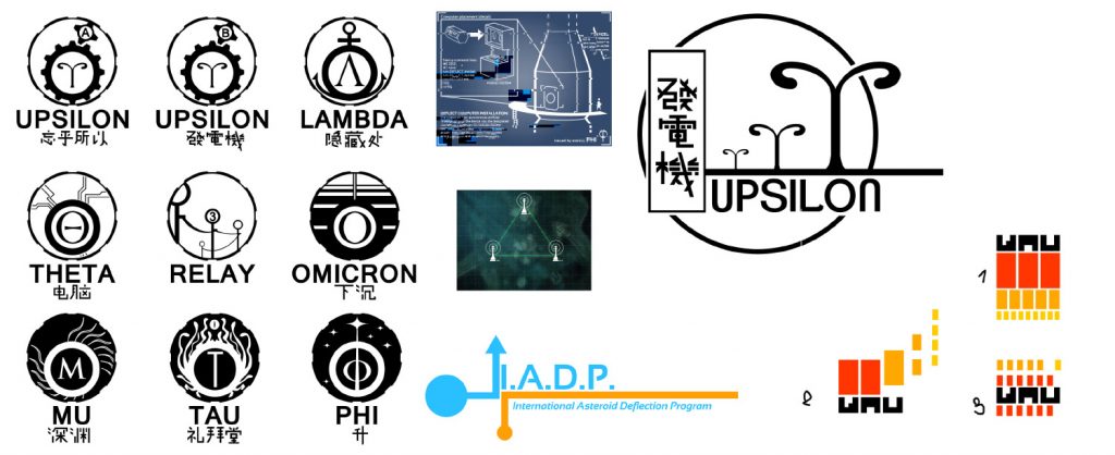
When the flashier GUI designs were still a thing, a lot of the other designs followed that same style. These are some of the examples before we decided to go for a more down-to-earth look.
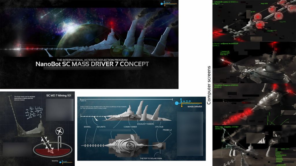
Now here’s something from our Alpha/Vertical Slice. Instead of the Ark being a supercomputer shot into the emptiness of space, it was actually meant to carry some “uncorrupted” WAU to the asteroid. There the WAU would grow a mass driver engine and push it out of the way. This didn’t fit well with our central themes so we removed it.
Hope you enjoyed the article! We’re working on some amazing things right now and hopefully we’ll be able to share some of it with you soon! If you’re interested, you can hit me up on Twitter @davidsatzinger or Instagram. I mostly post about random stuff or sports though!